LP-UIKITのテーマとスタイリングについて解説します。
LP-UIKITではBootstrap5を使用してCSSスタイルを作成しています。
変数の値を変更しているカラーパレットとデフォルトにはない値を設定できる拡張クラスがあります。
カラーパレットについて
カラーパレットはBootstrap5で追加されたテキストと背景に関する新しいカラーを使用しています。
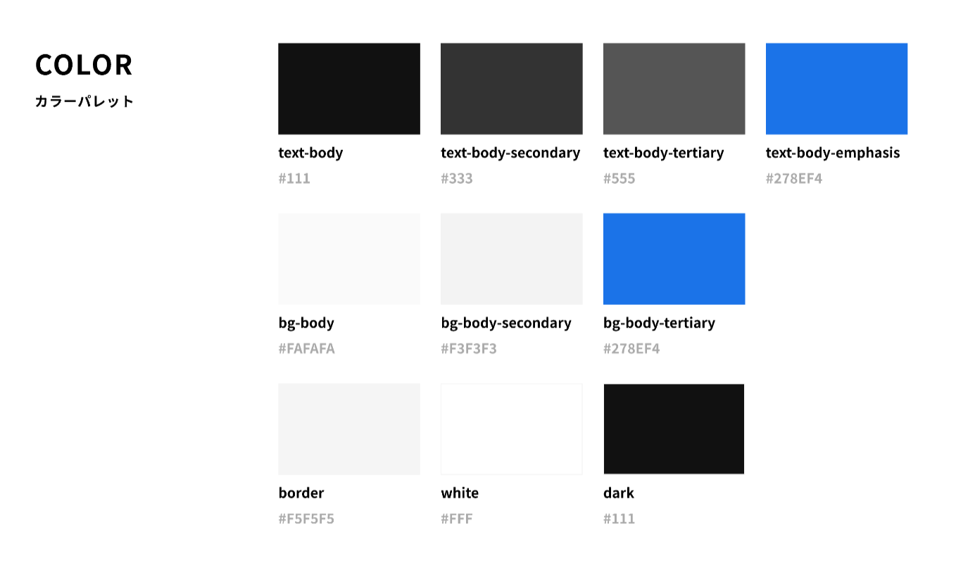
サンプルコードはこちら。text-をつけるとテキストカラー、bg-をつけると背景カラーになります。
<!-- $body-color -->
<p class="text-body"></p>
<!-- $body-secondary-color -->
<p class="text-body-secondary"></p>
<!-- $body-tertiary-color -->
<p class="text-body-tertiary"></p>
<!-- $body-emphasis-color -->
<p class="text-body-emphasis"></p>

<!-- $body-bg -->
<p class="bg-body"></p>
<!-- $body-secondary-bg -->
<p class="bg-body-secondary"></p>
<!-- $body-emphasis-color -->
<p class="bg-body-tertiary"></p>

<!-- $border-color -->
<p class="border"></p>
<!-- $body-tertiary-color -->
<p class="border-tertiary"></p>
<!-- $body-emphasis-color -->
<p class="border-emphasis"></p>

<!-- $white -->
<p class="bg-white"></p>
<!-- $dark -->
<p class="bg-dark"></p>
カラーパレット一覧。デフォルトカラーパレットはこちらです。
borderの色の指定は1色ですが、dark、tertiary、emphasisの色を使用できます。
$body-color:                #111;
$body-secondary-color:      #333;
$body-tertiary-color:       #555;
$body-emphasis-color:       #278EF4;

$body-bg:                   #FAFAFA;
$body-secondary-bg:         #F3F3F3;
$body-tertiary-bg:          #278EF4;

$border-color:              #F5F5F5;
// boder-dark = $dark
// border-tertiary = $body-tertiary-color
// border-emphasis = $body-emphasis-color

$white:         #FFF;
$dark:          #111;
拡張クラスについて
Bootstrap5で使えるCardコンポーネントやNavbarなどコンポーネントはデフォルトのまま使用することができます。
LP-UIKITでは以下のクラスを拡張し、デフォルトでは使えないフォントサイズの指定も可能です。
- フォントサイズ: フォントサイズ
- スペース: margin、padding、gapのサイズ
- サイズ: width、heightのサイズ
フォントサイズの拡張クラス
デザインのフォントサイズと同じサイズを使うことができます。
サンプルコードはこちら。フォントサイズの指定はfs-をつけます。
<!-- h1のサイズ -->
<p class="fs-1"></p>

<!-- text-lgのサイズ -->
<p class="fs-text-lg"></p>
サイズ一覧
$font-size-base:              1rem;
$h1-font-size:                $font-size-base * 2;
$h2-font-size:                $font-size-base * 1.875;
$h3-font-size:                $font-size-base * 1.75;
$h4-font-size:                $font-size-base * 1.5;
$h5-font-size:                $font-size-base * 1.375;
$h6-font-size:                $font-size-base * 1.25;
// scss-docs-end font-variables
$text-lg-font-size:                $font-size-base * 1.125;
$text-md-font-size:                $font-size-base;
$text-sm-font-size:                $font-size-base * 0.875;
$meta-lg-font-size:                $font-size-base * 0.875;
$meta-md-font-size:                $font-size-base * 0.75;
$meta-sm-font-size:                $font-size-base * 0.625;

// scss-docs-start font-sizes
$custom-sizes: (
  1: $h1-font-size,
  2: $h2-font-size,
  3: $h3-font-size,
  4: $h4-font-size,
  5: $h5-font-size,
  6: $h6-font-size,
  text-lg: $text-lg-font-size,
  text-md: $text-md-font-size,
  text-sm: $text-sm-font-size,
  meta-lg: $meta-lg-font-size,
  meta-md: $meta-md-font-size,
  meta-sm: $meta-sm-font-size
) !default;
スペース(余白)の拡張クラス
marginやpadding、flexやgridのgapで使える拡張クラスはこちらになります。
デフォルトでは0~5とautoの指定しかできませんが、LP-UIKITではより多くのマージンやパディングを指定できます。
拡張クラスではm--5のようにすると5pxのスペースを作成できます。
サンプルコードはこちら。余白の指定方法はBootstrap5公式のこちらをご覧ください。
<!-- 上下のマージン10px、左右のマージン30px、PCサイズで60px -->
<p class="my-10 mx-30 mx-lg-60"></p>

<!-- 横並びのflexbox、要素間のgap40px -->
<div class="d-flex align-items-center gap-40">
  <div>...</div>
  <div>...</div>
</div>

<!-- デフォルトの$spacer * 3の値 -->
<div class="mt-5"></div>

<!-- ハイフンをもう1つつけることで5pxを指定 -->
<div class="mt--5"></div>
スペース一覧。左側の数字がclassに記入する値、右側がCSSの値になります。
// margin, padding, gap
$custom-spacers: (
  240: 240px,
  200: 200px,
  160: 160px,
  140: 140px,
  120: 120px,
  100: 100px,
  80: 80px,
  60: 60px,
  50: 50px,
  40: 40px,
  30: 30px,
  25: 25px,
  24: 24px,
  20: 20px,
  16: 16px,
  15: 15px,
  12: 12px,
  10: 10px,
  -8: 8px,
  -6: 6px,
  -5: 5px,
  -4: 4px,
  -3: 3px,
  -2: 2px,
  -1: 1px
) !default;
// scss-docs-end spacer-variables-maps
$spacers: map-merge($spacers, $custom-spacers);
サイズの拡張クラス
widthとheightの拡張クラスはこちらになります。
サンプルコードはこちら。サイズの指定方法はBootstrap5公式のこちらをご覧ください。
<!-- width100% -->
<p class="w-100"></p>
サイズ一覧。左側の数字がclassに記入する値、右側がCSSの値になります。
$utilities: (
  "width": (
    property: width,
    class: w,
    values: (
      20: 20%,
      25: 25%,
      30: 30%,
      40: 40%,
      50: 50%,
      60: 60%,
      70: 70%,
      75: 75%,
      80: 80%,
      90: 90%,
      100: 100%,
      auto: auto
    )
  ),
  "height": (
    property: height,
    class: h,
    values: (
      20: 20%,
      25: 25%,
      30: 30%,
      40: 40%,
      50: 50%,
      60: 60%,
      70: 70%,
      75: 75%,
      80: 80%,
      90: 90%,
      100: 100%,
      auto: auto
    )
  )
);
拡張クラスのカスタマイズについて
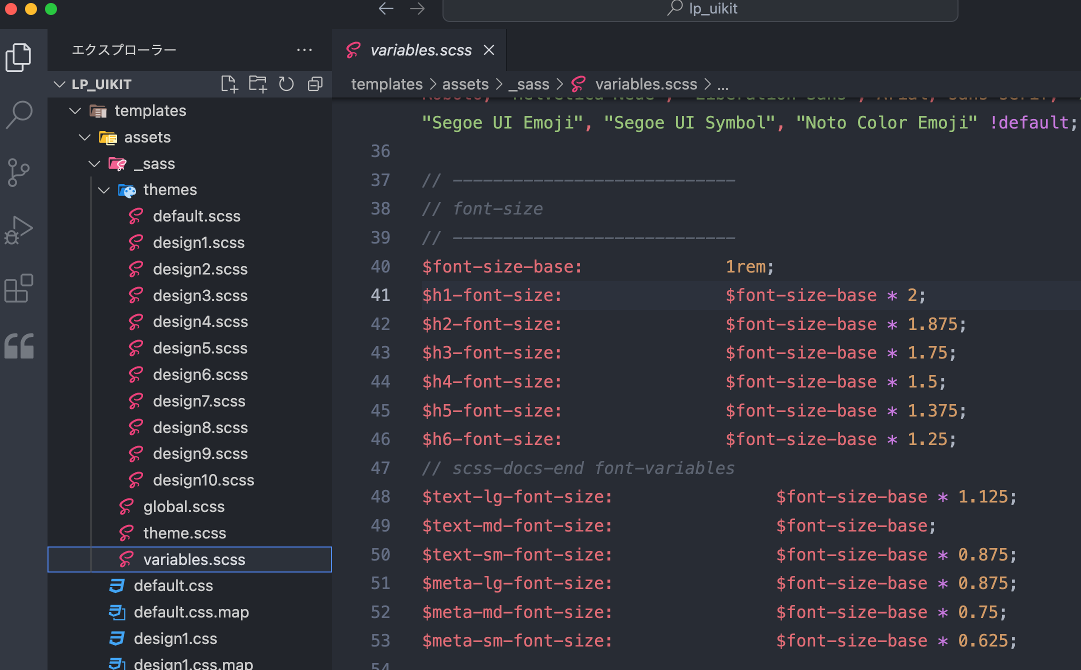
拡張クラスの変数は同梱のSCSSファイルに含まれています。
templates/assets/_sass/
- themes/ : テーマののカラーパレット
- global.scss : 全体で使用するスタイル
- theme.scss : テーマ作成用SCSSファイル
- variables.scss : 拡張クラスの変数をまとめたファイル
拡張クラスのカスタマイズにはSCSSをこんをコンパイルする必要があります。
また、カラーパレットや拡張クラスはBootstrap5を使用しています。Bootstrap5のインストールも必要です。